What does black remind you of?
Black holes, black tuxedoes, night sky, black cats, or even Black Sabbath.
Black is everywhere, influencing our emotions, culture, and visual language through both nature and sometimes human-made forms. Yet surprisingly, from a theoretical standpoint, black isn’t considered a color at all. In physics, black is often described as the absence of light.
Today, we dive deep into black color psychology, unpacking everything you need to know, from its origins and symbolism to its practical use in branding and marketing.
Table of Contents
The Origins of Black: A Historical Journey of the Color
In black color psychology, the color is often perceived as modern, minimal, or sophisticated, yet its visual history extends back tens of thousands of years. Long before formal theories of color existed, early humans were already producing and applying black pigments, making black one of the earliest documented colors in human visual expression.
Early Artistic Use of Black: Lascaux Caves and Tonal Contrast

Archaeological evidence from the Palaeolithic era shows that prehistoric artists relied primarily on charcoal derived from burnt wood, plants, or animal bones, as well as mineral blacks such as manganese oxide. These materials were often mixed with liquids such as water or animal fat and applied directly to cave walls, resulting in images that were not only visually striking but also remarkably durable. The accessibility and permanence of these pigments contributed to black’s foundational role in early visual culture.
One of the most frequently cited examples of early black pigment use is the “Great Black Bull” located in the Axial Gallery of the Lascaux Caves in France. The deliberate use of dense black pigment to define form, mass, and contrast suggests an early understanding of how tonal variation could enhance visual clarity and impact. While prehistoric artists did not conceptualize color psychology in modern terms, contemporary art historians interpret such uses of black as functional visual strategies. These early applications demonstrate how black could structure attention and meaning within an image, principles that continue to inform visual communication and design practice today.
Black Symbolism in Ancient Civilizations: Egypt, Greece, and Rome

As early civilizations developed, black acquired symbolic meanings closely tied to material and environmental realities, though these meanings varied significantly across cultures. In ancient Egypt, black symbolized fertility, regeneration, and life, reflecting the rich dark silt deposited by the Nile’s annual floods. In ancient Greece, black was widely used in pottery, particularly in black-figure techniques, and could carry associations with the underworld and death in mythological and funerary contexts. The ancient Romans formalized black as a color of mourning, wearing it during funerals and periods of grief. Across several early societies, black was frequently linked to earth, soil, night, and subterranean space, elements associated with transformation and cyclical renewal rather than solely negativity.
Medieval Interpretations of Black and Their Influence on Modern Black Color Psychology
During the early Middle Ages (roughly before the 14th century), black took on more explicitly negative connotations within dominant Western Christian ideology. It was frequently associated with sin, darkness, death, and moral corruption. At the same time, black remained relatively rare in elite dress, as aristocrats favored vivid and costly colors such as red, blue, and purple. In contrast, several monastic orders adopted black garments, often made from undyed wool, as symbols of humility, poverty, and penitence. These divergent uses demonstrate that black’s meaning was shaped less by inherent visual qualities and more by religious, social, and ideological frameworks.
The Rise of Black as Authority in Late Medieval Europe
By the 14th and 15th centuries, improvements in dyeing techniques made deep, saturated black fabrics increasingly achievable and expensive. As black textiles became technically refined and socially prestigious, the color was widely adopted by judges, magistrates, and legal authorities to communicate seriousness, restraint, and moral authority. Political leaders across Europe similarly embraced black as a marker of discipline, control, and institutional power. This period played a significant role in establishing associations between black, authority, and institutional seriousness, associations that later shaped modern black color psychology and contemporary branding practices.
Scientific Classification of Black: From Printing to Newton’s Color Theory

From the late Middle Ages into the early modern period, black’s conceptual status in Western thought shifted once more. The spread of printing technology, based on black ink on white paper, assigned black a functional and communicative role distinct from decorative color. This distinction was later reinforced by scientific developments. When Isaac Newton formalized the visible color spectrum in the mid-17th century (Newton, 1704), black and white were excluded because they were not associated with specific wavelengths of light. As a result, black was increasingly classified as a “non-color” within Western optical theory, influencing art education and color theory for centuries.
Modern Reinterpretations of Black in Art, Design, and Visual Communication
This scientific classification began to be challenged in the early 20th century, as modern artists, designers, and theorists emphasized perception, contrast, and contextual meaning over purely optical definitions. Black and white were increasingly treated as full color elements within artistic and design disciplines. Today, black functions as a foundational element in visual communication, branding, and marketing, valued for its psychological impact, symbolic weight, and ability to convey authority, sophistication, and clarity. Although many of these associations emerged within Western historical contexts, they continue to shape global design systems, often adapted, reinterpreted, or contested across cultures.
Black Color Psychology: Meanings, Emotions, and Perception

Why can a single color communicate luxury, authority, danger, and rebellion at the same time? Black color psychology explores how the color black shapes human emotion, perception, and interpretation primarily through culturally learned associations rather than fixed or universal biological responses. In design, branding, and visual communication, black carries a distinctive psychological weight that influences how people interpret products, environments, and messages. These responses emerge through cultural context, social conditioning, and individual experience, making black color psychology one of the most psychologically complex areas within visual design.
Black vs White in Western Culture: Emotional and Symbolic Contrast
In Western culture, particularly in the United States, black is commonly understood in contrast to white. While white is associated with light, openness, purity, and beginnings, black is often linked to depth, closure, silence, and finality. This contrast amplifies black’s emotional intensity and symbolic power. Depending on context, black can feel protective and authoritative or distant and intimidating. Designers and marketers intentionally work with this tension, using black to create visual hierarchies, establish mood, and guide interpretation within brand identity systems.
Power, Authority, and Control in Black Color Psychology
Within black color psychology, black is frequently associated with power, authority, and control. Its visual density and ability to absorb light contribute to perceptions of weight, seriousness, and restraint. In professional and institutional contexts in the United States, black is often used to signal discipline, credibility, and expertise. These associations explain its widespread use in corporate identity, legal attire, and luxury branding. At the same time, excessive use of black can feel emotionally restrictive or unapproachable, underscoring the importance of balance and contrast in effective visual design.
Black and Modernity: Technology, Precision, and Minimalist Design

In contemporary American design and technology, black has become closely associated with modernity, refinement, and efficiency. Many everyday objects, such as smartphones, luxury vehicles, and minimalist architecture, rely heavily on black surfaces to reduce visual noise and emphasize structure. Design theory often interprets black as clarifying form and prioritizing function over decoration. In digital environments, black is commonly perceived as timeless, precise, and durable, aligning with values such as innovation, reliability, and long-term performance. These perceptions contribute to black’s frequent use in technology branding and premium consumer products.
Mourning, Death, and Moral Gravity: The Heavier Dimensions of Black Color Psychology

Culturally, black retains a strong association with mourning and death in the United States and many Western societies. It is traditionally worn during funerals and memorials as a symbol of grief, solemnity, and respect. Beyond mourning, black is also linked to seriousness, formality, and moral gravity. In narrative media such as film, literature, and visual storytelling, these associations often extend to symbolic meanings related to fear, danger, or moral ambiguity. Importantly, these interpretations are culturally constructed rather than inherent qualities of the color itself, yet they continue to shape audience perception.
Rebellion, Subculture, and Symbolic Resistance Through Black

Black is also widely used to express rebellion, individuality, and resistance to dominant norms. In subcultures such as goth fashion, punk aesthetics, and heavy metal imagery, black functions as a visual marker of intensity, emotional depth, and independence. Similarly, villains and anti-heroes in popular media are frequently dressed in black as a visual shorthand for power, mystery, or ethical complexity. While these associations are symbolic rather than psychologically fixed, they remain effective because they are deeply embedded in shared visual codes.
Sophistication, Elegance, and Luxury: The Classier Side of Black Color Psychology
At the same time, black is strongly associated with sophistication, elegance, and luxury. In Western fashion and social traditions, formal black attire, such as tuxedos and evening wear, has long symbolized refinement, professionalism, and status. Black’s restrained appearance conveys control and intentionality without resorting to ornamentation. For this reason, black is often selected by brands and individuals seeking to project authority, credibility, and exclusivity in high-status contexts.
Sensuality, Mystery, and Emotional Restraint in Black Design
Black is also commonly linked to sensuality and allure in fashion, advertising, and visual culture. Dark tones can evoke intimacy and mystery by concealing rather than revealing, encouraging emotional engagement through suggestion. Beyond sensuality, black frequently symbolizes stability, seriousness, and reliability, reinforcing its dominance in professional environments and luxury branding. Its ability to balance authority, elegance, emotional restraint, and symbolic tension makes black one of the most versatile and strategically powerful colors in branding, marketing, and visual communication.
Black Personality: What It Reveals About Your Character

Why are some individuals consistently drawn to the color black? Within black color psychology, what is sometimes described as a “black personality” does not refer to a fixed psychological type or a scientifically defined personality category. Instead, it describes a set of symbolic traits and social perceptions commonly associated with a preference for black in clothing, personal style, environments, and self-presentation. These interpretations are shaped by cultural symbolism, social norms, and individual experience, and should be understood as general tendencies rather than universal truths. Color preference alone does not define character, and associations may change across contexts or life stages.
Control, Independence, and Personal Authority
People who favor black are often perceived as valuing control, independence, and personal authority. Culturally, black is associated with structure, order, and seriousness, qualities that can translate into a preference for self-discipline and clear boundaries. Individuals drawn to black may appear composed, intentional, and goal-oriented in their choices. This perception does not imply dominance or rigidity, but rather a desire to maintain autonomy and manage how one is seen by others. In many social contexts, black communicates self-possession and confidence without the need for overt display.
Emotional Restraint, Privacy, and Psychological Boundaries
A preference for black is also commonly linked to emotional restraint and privacy. Black’s visual opacity and depth symbolically align with discretion and containment, which helps explain why individuals who favor black are often perceived as emotionally reserved. This reserve can project calm confidence, maturity, and self-control. In social settings, such individuals may establish clear personal boundaries, not to withdraw emotionally, but to preserve inner balance and psychological space.
Mystery, Introspection, and Selective Self-Disclosure
Because black conceals rather than reveals, it is frequently associated with mystery and introspection. People drawn to black may be reflective, inward-focused, or selective about self-disclosure. This quality can sometimes be misinterpreted by others as emotional distance or coldness, even when it reflects thoughtfulness or caution in communication.
Stress, Resistance, and Symbolic Nonconformity as Potential Challenges in Black Color Personality
Under stress or during periods of transition, strong identification with black can express less adaptive tendencies. Excessive self-control may shift toward emotional suppression, while independence may harden into resistance to support or vulnerability. In some cases, black functions as a visual expression of resistance to social expectations or conventional norms. These patterns are situational and symbolic rather than permanent characteristics, and they should not be interpreted as defining features of personality.
In personal style and self-presentation, black is often chosen to communicate confidence, intentionality, and refinement without excess. Understanding the symbolic meanings associated with black allows individuals, designers, and brands to make more conscious choices about how color supports identity, mood, and communication, without reducing personality to color alone. In this way, black functions less as a statement of who someone is and more as a tool for how identity is expressed.
Positive Traits of a Black Personality
- Confident – Often self-assured and composed
- Independent – Values self-reliance and autonomy
- Disciplined – Strong sense of control and structure
- Ambitious – Highly goal-oriented and success-driven
- Authoritative – Natural leadership presence
- Sophisticated – Appears refined, elegant, and polished
- Resilient – Emotionally strong and mentally tough
- Focused – Able to concentrate deeply on objectives
- Serious-minded – Takes responsibilities and commitments seriously
- Private – Maintains clear personal boundaries
Negative Traits of a Black Personality
- Emotionally reserved – Difficulty expressing feelings
- Intimidating – Can appear overly strict or unapproachable
- Controlling – Desire for control may become excessive
- Rigid – Resistant to change or flexibility
- Pessimistic – Tendency toward negative thinking under stress
- Isolated – May distance themselves from others
- Authoritarian – Can be overly commanding or demanding
- Secretive – Keeps too much hidden, even from close people
- Work-obsessed – Over-focus on status or success
Why Is Black Color Not Included in Standard Color Wheels?
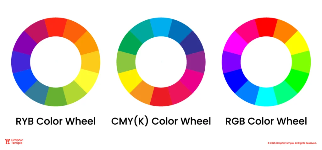
In color theory, a color wheel is primarily a map of hues. Colors that have neither a specific hue nor any saturation are classified as achromatic, meaning they have no chroma. Black is not considered a hue: in RGB it represents the absence of light, in CMYK it is treated as a neutral key ink, and in pigment systems it functions as a neutral darkener rather than a hue. As an achromatic color, Black does not belong to hue-based systems such as the RGB, RYB, or CMYK color wheels. Instead, black exists on a different dimension of color, one related to lightness and darkness, rather than hue itself.
Why Black Does Not Appear on the RGB Color Wheel?
In the RGB color model, black is not treated as a hue because it represents the absence of emitted light. RGB is an additive system, meaning colors are created by mixing light. When red, green, and blue are all at full intensity (R=255, G=255, B=255), the result is white. When all values are zero (R=0, G=0, B=0), there is no light, which we perceive as black. Because of this, black is not a hue and does not appear on the RGB color wheel.
The Role of Black in CMYK Printing Systems
CMYK is a subtractive color model, meaning colors are created by absorbing light using ink or pigment. In theory, mixing cyan, magenta, and yellow should absorb most light and produce black. In practice, real inks are imperfect, so a CMY mix typically results in a muddy dark brown or gray rather than a deep, neutral black. To achieve deeper blacks, sharper text, and more cost-effective, faster-drying prints, printers use a dedicated Key (K) black ink. Black is not shown on the CMY color wheel because the wheel maps hue relationships, while black functions as a control for darkness and neutrality, not hue, making K a fourth component rather than part of the core CMY color-mixing circle.
Black in the RYB Color Wheel and Artistic Practice
The RYB color wheel is traditionally used in painting and art education. While it is not based on modern color science, it remains a practical system for mixing pigments. In RYB, black is treated as a neutral rather than a hue. Artists use black primarily to adjust value (darkness) and often to reduce chroma, making colors appear more muted. Black is not included on the color wheel because the wheel focuses on hues that interact to create other colors. Instead, black is used to create shades or neutral tones, and many artists prefer mixing complementary colors to produce richer, more natural darks rather than relying solely on pure black pigment.
Cultural Meanings of Black Across the World
Black carries diverse and often contrasting meanings across cultures. Its symbolism is shaped by history, belief systems, religious traditions, and social norms rather than universal rules. As a result, black does not communicate a single, fixed message worldwide; instead, it functions as a context-dependent color whose meaning shifts across time and place. Understanding these differences is essential for designers and brands applying black color psychology in global or multicultural contexts.
Western Cultures (United States and Europe)
In many Western societies, black is traditionally associated with mourning, death, and solemnity, particularly in funeral practices. It is also widely used in institutional and professional contexts, such as legal systems, formal dress, and corporate environments, where it commonly symbolizes authority, seriousness, restraint, and control. In European fashion history in particular, black has become closely linked to sophistication, minimalism, and timeless elegance, reinforced by its long-standing presence in formal and high-end design.

In contemporary Western culture, black also plays a prominent role in sports, entertainment, and subcultures. Many professional US sports teams (Las Vegas Raiders, Pittsburgh Steelers, Brooklyn Nets) adopt black uniforms to project strength and dominance, and audiences often perceive black teams as more intimidating or aggressive, an effect shaped by cultural expectation rather than inherent psychological response. Black is central to Halloween symbolism, where it represents night, mystery, the unknown, and the supernatural. In goth, rock, and metal subcultures, black is frequently used to express emotional depth, introspection, rebellion, and resistance to mainstream norms. These meanings are culturally reinforced and widely recognized, making black a powerful visual signal within these contexts.
Middle Eastern Cultural Contexts

In many Middle Eastern cultures, black carries layered and sometimes dual meanings. It can symbolize dignity, formality, and elegance in ceremonial dress, calligraphy, and traditional aesthetics. At the same time, black is strongly associated with mourning and remembrance, particularly during religious observances such as Muharram in Shia Islam.
For Muslim women, garments such as the abaya, hijab, niqab, and shayla, often worn in black, are commonly understood as expressions of modesty, seriousness, humility, and spiritual discipline, rather than symbols of sadness or oppression. These interpretations are shaped by religious, cultural, and social frameworks and vary across regions, communities, and individual contexts, contributing to the complexity of black color psychology.
East Asian and African Perspectives

In East Asian philosophy, black can carry meanings that differ significantly from Western interpretations. In traditional Chinese thought, black is associated with the element of water in the Wu Xing (Five Elements) system and is linked to depth, stillness, and the unknown. Rather than symbolizing negativity, black is often understood as representing potential, balance, and latent power.
Across several African cultural traditions, black is frequently linked to maturity, age, authority, and ancestral wisdom. Rather than symbolizing death alone, black can represent continuity, life force, and respect for elders. These meanings vary widely across regions and ethnic groups and should be understood as broad symbolic tendencies rather than uniform interpretations.
A widely recognized cross-cultural example is the black belt in martial arts, which symbolizes mastery of fundamentals, discipline, and long-term commitment. Contrary to popular misconception, the black belt does not signify an endpoint but the beginning of deeper learning, responsibility, humility, and continuous self-improvement.
Design and Branding Implications
These cultural variations demonstrate that black is a highly sensitive color in global communication. While it may signal authority and sophistication in one context, it may convey mourning, spirituality, or resistance in another. For designers and brands operating internationally, understanding the cultural meaning of black across regions helps prevent misinterpretation and enables more respectful, effective visual communication.
Rather than treating black as a neutral default, effective global design applies black color psychology deliberately, considering cultural symbolism, audience expectations, and contextual meaning.
Black in Branding: Strategic Design Uses
From a black color psychology perspective, black plays a distinctive and enduring role in branding. While contemporary brands have access to expansive color systems, black remains effective not as a default aesthetic, but as a strategic design tool. Its power lies in its ability to communicate clarity, authority, and restraint when applied intentionally and within appropriate cultural and market contexts.
Historical Foundations of Black in Brand Communication

Throughout much of the nineteenth century, branding and advertising relied heavily on black ink primarily due to technological and economic constraints rather than stylistic choice. Early printing methods largely restricted visual communication to black ink on white paper, shaping logos, posters, newspapers, and advertisements in monochrome. Repeated exposure during this period established black as a signal of legibility, permanence, and institutional authority.
The introduction of chromolithography in the mid-nineteenth century enabled mass color printing and gradually expanded the visual language of advertising. Black did not disappear with this shift; instead, it transitioned from technical necessity to deliberate design choice. Designers began using black selectively to create contrast, hierarchy, and seriousness, establishing the foundation for its modern strategic role in branding.
Black as a Signal of Authority and Professionalism
In contemporary branding, black is widely used to communicate authority, credibility, and control. Law firms, financial institutions, newspapers, and professional service brands frequently rely on black to project seriousness and trustworthiness. These associations are culturally reinforced rather than biologically fixed, shaped by long-standing institutional use and formal dress conventions.
Black’s visual weight allows brands to assert presence without ornamentation. However, excessive or unbalanced use can create emotional distance or rigidity, which is why effective corporate branding typically offsets black with generous whitespace, neutral tones, or restrained accent colors.
The Role of Black in Luxury and Premium Branding
Black occupies a central position in luxury fashion, lifestyle, and product branding. Brands such as Chanel, Louis Vuitton, Rolex, and Hugo Boss use black to signal refinement, exclusivity, and continuity across time. In this context, black functions as a stabilizing color, less responsive to seasonal trends and more closely aligned with permanence, heritage, and craftsmanship.
Its material versatility allows black to perform consistently across print, digital, textile, and packaging applications. When paired with disciplined typography and controlled contrast, black reinforces perceptions of intentionality, quality, and long-term value.
Black in Sports, Technology, and Performance Branding
Performance-oriented brands often use black to communicate strength, focus, and confidence. Global sportswear brands such as Nike, adidas, and Puma incorporate black into their visual systems to reinforce boldness and competitive intensity. While associations between black and power are culturally conditioned, they function as widely recognized visual cues within sports and performance contexts.
In technology branding, black is frequently associated with modernity, precision, and efficiency. Minimalist interfaces, hardware finishes, and product packaging often rely on black to reduce visual noise and emphasize form and function. This positions products as serious, refined, and purpose-driven rather than decorative.
Using Black Strategically Through Contrast and Color Pairing

The effectiveness of black depends heavily on what it is paired with. High-contrast combinations, such as black with white, gold, or restrained accent colors, can enhance visibility and reinforce specific brand values. For example, black paired with gold often signals elegance and exclusivity, while black combined with bold accents can introduce energy and contemporary relevance.
Rather than functioning as a standalone solution, black works best as a structural color, supporting hierarchy, emphasis, and tone. Designers who understand black color psychology are better equipped to make informed decisions about balance, contrast, and emotional impact.
Strategic Risks of Overusing Black in Brand Identity
Despite its strengths, black is not universally effective. Overuse or unconsidered application can make a brand appear intimidating, cold, or inaccessible, particularly to audiences seeking warmth, friendliness, or emotional approachability. In mass-market or low-cost contexts, black may also feel generic if it lacks clear intent or differentiation.
Because black has long been associated with cost-efficient printing and default design solutions, black-and-white applications may signal austerity rather than quality when not supported by strong hierarchy, contrast, and typographic discipline.
Branding Implications of Black Color Psychology
Black remains one of the most symbolically dense and versatile colors in branding. Its ability to communicate authority, sophistication, strength, and restraint makes it effective across industries, but only when used with cultural awareness and strategic intent.
Successful brands do not rely on black by default. They deploy it deliberately, aligning its psychological and symbolic associations with audience expectations, brand positioning, and contextual meaning to ensure black communicates purpose, quality, and value rather than severity or indifference.
When to Avoid Black: Why Black Isn’t Always the Right Choice for Your Brand
Although black is one of the most powerful and widely used colors in branding, insights from black color psychology suggest that it is not universally effective across all industries or audiences. The psychological associations of black, such as seriousness, restraint, and authority, can conflict with brand goals that rely on warmth, openness, playfulness, or emotional comfort. In these contexts, black may weaken emotional connection, shape perception in unintended ways, or communicate unintended signals.
Health and Wellness Brands

Black is often a challenging choice for health, wellness, and care-focused brands. Its dark visual weight and associations with seriousness or emotional distance can feel cold or intimidating, particularly in industries where trust, reassurance, vitality, and safety are essential. Brands in healthcare, fitness, nutrition, or mental wellness typically benefit more from lighter, fresher colors that suggest cleanliness, balance, and emotional ease. While black may still function as a supporting accent, it is often less effective as a dominant brand color in these sectors.
Children’s Brands and Youth-Focused Products

Brands targeting children or young families generally avoid black as a primary color. Children respond more strongly to bright, high-energy hues that stimulate curiosity, imagination, and play. Black lacks the visual warmth and emotional accessibility that support engagement in children’s products, retail environments, and educational materials. When used excessively, it may feel serious or dull rather than inviting or fun. For youth-oriented brands, color palettes that emphasize vibrancy and contrast tend to support engagement and approachability more effectively.
Food, Beverage, and Fast Food Brands
Black is relatively uncommon as a dominant color in fast-food and casual dining branding. Colors such as red, orange, and yellow are more frequently used because they are culturally associated with appetite stimulation, energy, and quick decision-making. Black, by contrast, can reduce appetite appeal or slow emotional response when used without balance. That said, black can work successfully when paired with vivid secondary colors or used in premium dining contexts, where sophistication rather than speed or excitement is the primary goal.
Entertainment and Leisure Brands

Brands built around fun, entertainment, celebration, or emotional uplift often struggle when black dominates their visual identity. Black’s seriousness and emotional restraint can drain perceived energy, making these brands feel distant or overly formal. In such cases, black may undermine the sense of joy, spontaneity, or approachability that audiences expect. While black can still be used for contrast or structure, lighter and more expressive colors usually better support these brand personalities.
Using Black Strategically Rather Than Eliminating It Entirely
Avoiding black does not mean eliminating it entirely. In many of these industries, black can still function effectively as a secondary or structural color, supporting typography, layout, or contrast without dominating emotional tone. The key insight from black color psychology is not that black is “bad,” but that its psychological weight must align with brand intent, audience expectations, and emotional goals.
Brands benefit most when black is chosen deliberately rather than by default, used where authority and restraint add value, and avoided where warmth, playfulness, or emotional openness are central to the brand experience.
Black Color Conversions: RGB, CMYK, HEX, and More
| Value | |
| HEX | #000000 |
| RGB Decimal | 0, 0, 0 |
| RGB Percentage | 0%, 0%, 0% |
| CMYK | 0%, 0%, 0%, 100% |
| HSB | 0°, 0%, 0% |
| HSL | 0°, 0%, 0% |
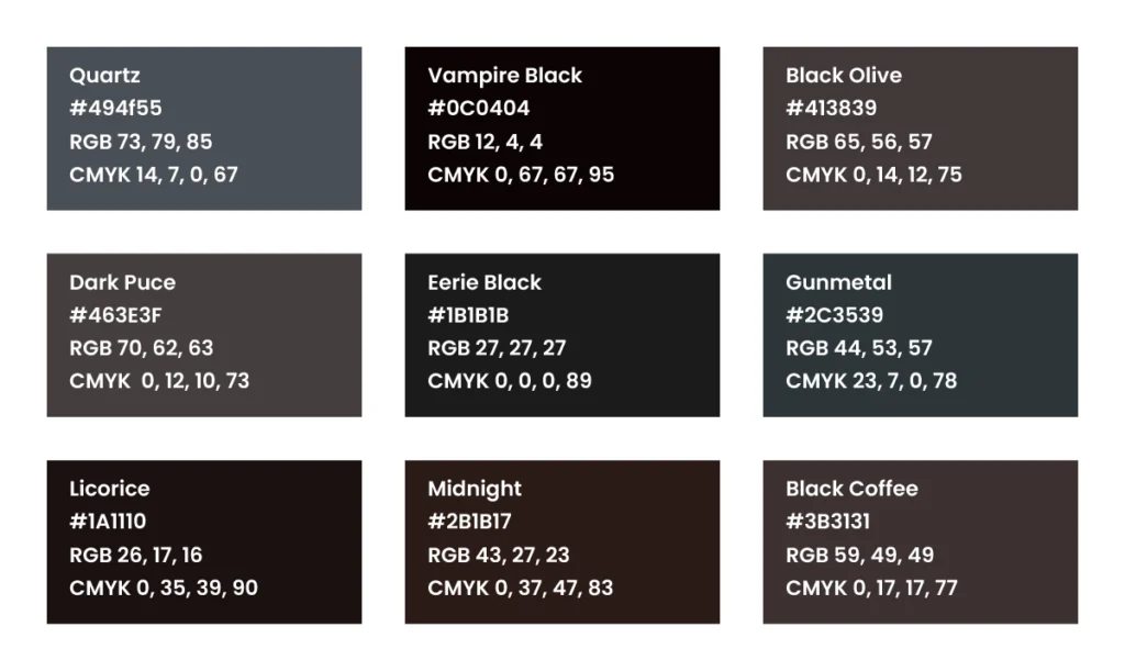
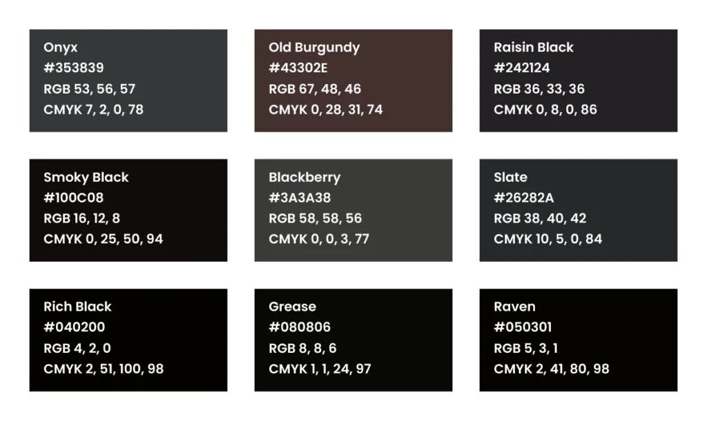
Popular Black Shades
To Sum It All Up
Black color psychology reveals that black is a complex and context-dependent color whose meaning extends far beyond simple associations with darkness or mourning. Shaped by historical usage, cultural symbolism, and psychological perception, black has come to represent authority, sophistication, control, and elegance, while also carrying connotations of restraint, mystery, and seriousness depending on how and where it is applied.
This dual nature makes black one of the most powerful and demanding colors in branding. Its effectiveness depends not on visual appeal alone, but on alignment between cultural context, audience expectations, and brand intent. When used deliberately, black can strengthen perceived credibility, elevate brand positioning, and create lasting emotional resonance. When used without intention, it can weaken connection or communicate unintended signals.
Understanding black color psychology enables designers and brands to move beyond default color choices and toward informed, strategic decision-making. Rather than functioning as a universal solution, black should be treated as a precise design instrument, one that requires balance, contrast, and contextual awareness to achieve its full potential.
By applying these black color psychology principles thoughtfully, black can become a powerful contributor to meaningful visual communication, reinforcing clarity, purpose, and long-term brand value across design disciplines.
If you have any questions about black color psychology, branding decisions, or color usage in visual design, feel free to reach out to us. Follow Graphic Temple on Pinterest, Instagram, and our other social channels to stay updated on practical design knowledge and inspiration.
Related Color Psychology Guides
Note: All logos and brand names used in this blog post are the property of their respective owners and are used strictly for educational and informational purposes only.
Sources & Further Reading
- Newton, I. (1704). Opticks: Or, A Treatise of the Reflections, Refractions, Inflections and Colours of Light. London.
- Pastoureau, M. (2008). Black: The History of a Color. Princeton University Press.
- Goethe, J. W. von. (1810). Theory of Colours.
- Fairchild, M. D. (2013). Color Appearance Models. Wiley.
- Royal Academy of Arts. “Isaac Newton and the Spectrum of Light.”
- Encyclopaedia Britannica. “Black | Description, Etymology, & Facts | Britannica”