Imagine you’re running on a hot, sunny day, completely exhausted. Then you spot a chilled glass of orange juice. Instantly, you feel a burst of freshness, warmth, and energy. It isn’t only the drink making you feel refreshed and energized; the color orange deserves just as much credit. That’s orange color psychology in action.
Today, we’re going to explore what the color orange symbolizes, its meaning, emotional impact, and the real-world ways it shows up in branding, marketing, design, advertising, and beyond. Orange is more than just a bright, warm hue; it carries a personality of its own, with both positive and negative traits that influence how people feel and react. Understanding these nuances helps you make more intentional design decisions, communicate moods more effectively, and use color in a way that feels purposeful rather than accidental. Together, let’s unpack the layers of orange color psychology.
Table of Contents
The Birth of the Color Orange and Its Journey Through History

Which came first? The color of the fruit? Surprisingly, the fruit did. Until the 16th century, Europeans didn’t even have a word for the color we now call orange. They simply referred to it as “yellow-red.” This changed when Portuguese traders brought orange trees from China to Europe. Once the fruit became familiar, the color finally gained its modern name. In English and French, it became orange; in Spanish, naranja; in Italian, arancia; and in Portuguese, laranja.
Even though many cultures had no specific name for the color, its history stretches back thousands of years. Some of the earliest orange pigments appear in the cave paintings of Lascaux, France, and in the tombs of Ancient Egypt. These brilliant orange hues were created using natural minerals such as ochres, realgar, and orpiment, beautiful but often toxic, especially because many of them contained high levels of arsenic.
Their use gradually declined in the 19th century as new synthetic pigments became available. After French chemist Louis Vauquelin discovered the element chromium in 1797, it led to the development of lead chromate and, eventually, to the introduction of chrome orange in the early 1800s. These chrome-based pigments offered brighter, more stable colors than earlier mineral pigments, though they remained toxic due to their lead content. Truly non-toxic orange dyes and pigments only emerged later, with the development of modern synthetic and organic pigments in the 20th century.
Today, orange is everywhere, from lifeboats and safety gear to monks’ robes, prison uniforms, construction zones, and countless branding choices. A color that once came from ancient minerals and unnamed traditions is now one of the world’s most recognizable and purposeful hues. Orange color psychology shows just how strongly this color influences our decisions and emotions.
Orange Color Psychology: Meaning, Emotion, and Impact

Orange is a warm, bold color you just can’t overlook. Whenever it shows up on a sign or billboard, your eyes go straight to it. It naturally radiates enthusiasm, energy, and joy. Most of the time, orange creates bright, happy, and uplifting feelings in people without even trying. This is the core of orange color psychology, a color that energizes and excites. But in some situations, it can feel a bit too bright or overwhelming, a reminder that orange can have both positive and negative emotional effects on human psychology.
As we dive deeper into orange color psychology and how the color influences human emotion, it’s important to remember that color meanings aren’t universal. Cultural differences can significantly influence how people feel about specific colors and how they interpret their symbolism. For example, in the United States, orange is used for prison uniforms because its high visibility helps prevent escapes. In contrast, in many Hindu cultures, sadhus wear orange as a sacred color, symbolizing purity, devotion, and a life dedicated to spiritual practice. That’s why it’s always wise to consider cultural associations before choosing colors for your brand.
Orange is also seen as a fun, uplifting color that gives emotional strength. It helps increase oxygen circulation in the brain, which can enhance creativity and mental activity, a connection often explained through orange color psychology. That’s one reason tech brands like Firefox and Blogger incorporate orange into their logos. You’ll also see orange frequently in food brands and children’s products. Its playful, attention-grabbing nature works perfectly for those industries. And because orange naturally pulls your eye, it’s also used as a caution signal. That’s why traffic cones, safety helmets, and construction workers’ jackets are typically orange: it makes them instantly visible and hard to miss.

One study suggests that orange can boost energy levels, which might make it harder to focus on demanding cognitive tasks like studying. This fits with orange color psychology, where high-wavelength colors like orange and red tend to increase arousal and mental stimulation. Orange is also connected to positive imagery: bright sunsets, citrus fruits, and feelings of warmth and joy. Another study shows that customers often perceive orange as playful, approachable, inexpensive, and friendly, all traits that reinforce how orange color psychology shapes perception. It’s a color that feels both welcoming and energetic.
In many Buddhist cultures, monks wear orange robes for both symbolic and historical reasons. Traditionally, orange dye was one of the most accessible colors. Within Buddhism, the color represents detachment from materialism and the letting go of worldly desires.
Different shades of orange can trigger very different emotions. For example, burnt orange often feels sophisticated and warm. Bright orange, on the other hand, delivers a burst of energy and urgency; it’s bold, loud, and instantly attention-grabbing. Peach tones lean in the opposite direction: soft, subtle, and calming. Meanwhile, muted oranges tend to feel grounded and comforting, symbolizing warmth and stability without overwhelming the viewer.
But orange isn’t all sunshine; too much of it can feel loud, superficial, or even a little arrogant. Overdo it, and the color becomes overwhelming fast. This duality is something often explained in orange color psychology, where orange can be warm and joyful or intense and cautionary depending on context. That’s why it’s a color you need to use with intention.
Orange Color Personality

If orange is your favorite color, you’re likely someone with a warm, optimistic, and outgoing personality. Studies on orange color psychology show that people who gravitate toward orange often share certain well-known traits. You might not relate to every single one of them, but you’ll definitely see a few that resonate — whether they’re positive or not-so-positive.
Orange personalities genuinely enjoy being around others and tend to thrive in social settings. Their enthusiasm is contagious, the kind of energy that instantly makes people feel welcomed and included. At the same time, they’re naturally adventurous. They’re drawn to new experiences and anything that adds excitement to life. They thrive on movement, creativity, and the freedom to express themselves openly.
People who love orange often look for connections built on shared interests and active experiences. They usually have a wide circle of friends and carry an unwavering sense of optimism, believing that things will eventually work out in their favor. Those with strong “orange personality” traits tend to be witty, spontaneous, generous, eager, and bold.
On the negative side, orange color psychology shows that orange personalities can be a little impatient and not always consistent. When they do get upset, a bit of humor usually helps lighten the mood. Their charm often puts them in the role of the negotiator, but it can also make them seem a little flashy at times.
Positive Traits of an Orange Personality
- Optimistic – They naturally look on the bright side and expect good outcomes.
- Energetic – They bring enthusiasm and liveliness to any environment.
- Sociable – Comfortable in groups, they enjoy building connections and making people feel included.
- Creative & Expressive – They thrive when they can express themselves freely and explore ideas.
- Adventurous – They love new experiences, challenges, and excitement.
- Warm-Hearted – Shows warmth, compassion, and gentle affection.
- Agreeable – Easygoing and cooperative.
Negative Traits of an Orange Personality
- Impatient – They may struggle with waiting, slow processes, or long-term projects.
- Inconsistent – Their excitement fades quickly, making it hard to stay committed.
- Attention-Seeking – They sometimes enjoy the spotlight a little too much.
- Easily Overstimulated – Too much activity or noise can overwhelm their emotional balance.
- Impulsive – They may act without thinking things through, driven by immediate excitement.
- Dependent – Often seeks support or reassurance from others.
- Superficial – May focus more on appearances than depth.
Orange in Color Wheels: How Color Orange Is Created in Different Color Models

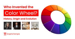
As we explore orange color psychology, it’s essential to understand how each color model defines the color orange. In the traditional RYB color model, orange is created by mixing equal amounts of red and yellow, making it a secondary color on the RYB color wheel. However, things work a little differently in the RGB and CMYK models. Even though orange still appears when red and yellow are blended in the same quantities, it’s classified as a tertiary color in these modern systems. This is because RGB and CMYK are built on different primary hues and more precise numerical relationships, so orange falls into the category of colors that sit between the main primaries and secondaries.
Orange Across Cultures: Symbolism and Global Interpretations
Humans have used the color orange for thousands of years across almost every civilization. What makes orange so fascinating is that its meaning shifts dramatically from one culture to another. While many people see orange as warm, joyful, and uplifting, the interpretation and symbolism of orange color psychology become much deeper and more complex when viewed through a global lens.

In South Asian cultures, especially in India and Sri Lanka, the orange carries profound spiritual and sacred meaning. The saffron-like shade of orange represents purity, devotion, discipline, and religious dedication. It’s closely tied to Hinduism and Buddhism.
In Japan, it symbolizes courage, strength, and positive energy. In China, the color orange is associated with good fortune, prosperity, and happiness. It’s a color of progress and abundance, which is why you’ll often see orange in festivals, celebrations, and symbolic decorations. For many Eastern cultures, orange represents good health, vitality, and a promising future.

In Western cultures, orange is associated with warmth, autumn, harvest, and seasonal change. It brings to mind falling leaves, cozy evenings, and the transition into winter. At the same time, orange has a strong safety-related function, from lifeboats and lifejackets to construction signs, traffic cones, astronaut suits, and even landmarks like the Golden Gate Bridge. Its high visibility makes it a universal color of alertness and protection.
Orange also carries a national identity in certain regions. In the Netherlands, it represents pride, unity, and the Dutch royal family, a patriotic color worn during national celebrations and by the national football team. Some cultures attach more somber meanings to orange. In parts of the Middle East, it is associated with mourning and loss. This shows just how layered and culturally dependent color symbolism can be.
All these perspectives highlight just how powerful and versatile orange truly is, and why understanding orange color psychology is so important. A color that feels spiritual and sacred in one place might feel energetic, festive, or even political in another. For brands and designers creating work for global audiences, understanding these nuances is essential. The right shade of orange can elevate your message; the wrong one can create confusion or send an unintended signal. When used with cultural awareness, orange becomes one of the most expressive and meaningful colors in the palette.
Using Orange in Branding, Marketing, and Design: Practical Uses of Orange Color Psychology

If you want your brand to feel fun, active, youthful, warm, or energetic, orange is one of the best colors you can choose. Since orange is created by blending red and yellow, it carries the energy of red and the happiness of yellow. That’s why it comes across as warm, confident, uplifting, and full of life. It’s the color of enthusiasm, playfulness, heat, creativity, and approachability, a hue that instantly feels friendly and inviting. But the real strength of orange lies in knowing when to use it and when to avoid it. Used thoughtfully, It’s incredibly versatile and works beautifully across industries like food and beverage, technology, retail, and entertainment; something often emphasized in orange color psychology.
Brands like Nickelodeon, Dunkin’, Fanta, and Tide use orange to express joy, friendliness, and an upbeat spirit, classic traits tied to orange color psychology. On the other hand, brands like Harley-Davidson and Timberland, and sports teams such as the Cincinnati Bengals, Philadelphia Flyers, and Clemson Tigers, use orange to express boldness, movement, and a fearless, risk-taking spirit, all strong psychological cues associated with orange.
Orange also works beautifully for brands that want to project optimism and self-confidence. In the tech world, Mozilla Firefox uses it to signal creativity, efficiency, and a modern, innovative attitude. The color also has an “affordable but reliable” feel, which is why brands like The Home Depot and Amazon use orange to communicate value, accessibility, and strong customer service.

In the food and beverage world, orange is often used to communicate flavor, freshness, and energy. It’s no surprise that nearly every orange juice bottle, carton, or label features orange as a dominant color; that’s not an accident. High-energy businesses love orange for a reason. Gyms, sports brands, and online retailers leverage orange color psychology because it motivates users and encourages decisive action. It’s also a perfect fit for fun, kid-focused businesses like toy stores, where bright, bold colors instantly capture attention and spark excitement.
Orange is naturally attention-grabbing, and pairing it with the right hues can amplify its impact. Different brands use specific tints, shades, and tones of orange depending on their audience and the values they want to communicate. For example, peach feels friendly, polite, and relaxed. Golden orange suggests energy, wisdom, wealth, and a sense of prestige. Red-orange, on the other hand, carries intensity; it signals desire, dominance, aggression, and a strong drive for action.
You can see this versatility in real-world branding. FedEx combines orange with purple to create a high-contrast, memorable identity. Fanta pairs orange with blue to capture energy, refreshment, and youthfulness. MasterCard blends orange and red, two high-visibility colors, to convey confidence, urgency, and a global presence. These combinations show how adaptable orange is: depending on how you use it, the color can shift moods, strengthen messages, and make a brand instantly recognizable. That’s why having a solid understanding of how orange color psychology works is vital as a designer.
When Not to Use Orange: Situations Where the Color Can Backfire
If your brand wants to appear sophisticated and highly professional, orange may not be the ideal choice. Surveys have shown that about 26% of people perceive orange as a “cheap” color, which can work against brands that need to project seriousness and authority. This is why industries like law firms, insurance companies, finance, and corporate consulting typically avoid orange; it doesn’t match the tone of trust, stability, and formality that their audiences expect.
Orange can also convey a sense of immaturity when used in the wrong context, and overuse can overwhelm your brand identity, making customers feel anxious or overstimulated. It may unintentionally make a brand feel superficial, unfocused, or lower in quality, as with any color, moderation and context matter. The key is to understand your audience and choose colors that support the message you want to send.
It’s also important to remember that the meaning of orange isn’t universal. In orange color psychology, understanding cultural context is crucial. Different cultures interpret color differently, so brands should always research regional associations before using it. A shade that feels fun and energetic in one country might carry a completely different meaning elsewhere.
Orange Color Conversions: RGB, CMYK, HEX, and More
| Value | |
| HEX | #FFA500 |
| RGB Decimal | 255,165,0 |
| RGB Percentage | 100%, 64.7%, 0% |
| CMYK | 0%, 41%, 100%, 0% |
| HSB | 39%, 100%, 100% |
| HSL | 39%, 100%, 50% |
Popular Orange Hues


To sum up, orange is a color that stands out. It’s bold, energetic, and carries deep meaning in many cultures, design styles, and brands. Understanding orange color psychology, how it works, where it excels, where it falls short, and the emotions it evokes, helps you use it with purpose and confidence. Whether you’re working on a brand or designing a product, orange can be a strong choice when used carefully. Keep trying new things, keep learning, and keep creating. If you have questions, leave a comment or send us a message. We’re happy to help. And don’t forget to grab our free Color Theory Cheat Sheet PDF.


