What exactly is value in color theory?
To understand, let me take you on a quick journey. More than 15,000 years ago, before the modern arts and digital designs, prehistoric humans created the first pigments, using burnt charcoal, soil, animal fat, and chalk. Fast-forward to the 17th century: Sir Isaac Newton introduced the first color wheel, transforming our understanding of color. Since then, humans’ perception of color has become far more precise. In modern color theory, color is broken down into three main properties: hue, saturation, and value.
In this article, we’ll focus on what value means, why it matters, and how it shapes the way we see color. Let’s dive in.
Table of Contents
Color in the Modern World: More Powerful Than You Think

Today, color is one of the most powerful tools in the world. It carries strong expressive power. Color can alter how you feel, change the way you perceive things, and help convey meaning without a word. Color controls visual focus and plays a key role in how a message is interpreted, whether it’s in marketing, branding, advertising, UI/UX design, packaging, fashion, interior design, photography, cinematography, traditional art, web design, or many other fields. In almost every visual industry, color matters.
What is Color?
In simple terms, Color is what we see when the spectrum of light interacts with an object’s surfaces. The surface of the object absorbs some wavelengths of the light, and the remaining wavelengths are reflected toward us. Our eyes capture those reflected wavelengths, and the brain identifies them as familiar colors, such as red, yellow, blue, green, pink, brown, gray, and countless more.
What is Color Theory?
In graphic design, color theory is the study that explains how colors interact, mix, match, or contrast with one another and how these relationships influence our visual and emotional experience. Color theory blends the science and the art of using color. Its principles guide us, designers, in choosing and applying colors to express emotions, communicate messages, and enhance user experience.
Fundamentally, color theory involves principles such as the color wheel, color harmony, value, saturation, and the psychological effects that different colors (or hues) have on humans. Since the development of modern color theory, color has become an incredibly powerful tool in design.
What is Value in Color Theory?
As mentioned before, in modern color theory, color consists of three primary properties.
- Hue – In daily use, the term “hue” is often understood as just another way of saying “color” or “shade.” It’s the primary identity of a color, such as red, yellow, blue, green, and so on, before it’s lightened, darkened, or desaturated..
- Saturation – Saturation is how rich or muted a color appears. Highly saturated colors look vivid and bright, while low-saturated colors look faded, dull, or grayish. Bright neon red is highly saturated, while a pale pink is low in saturation.
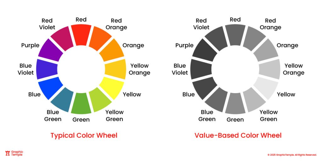
- Value – In color theory, value refers to the relative lightness or darkness of a color, which affects contrast, depth, and mood in a design. It indicates how close a color is to pure white or pure black. A color with a high value is very light (for example, pastel pink), while a color with a low value is very dark (such as navy blue or maroon).
The Relationship Between Hue, Saturation, and Value
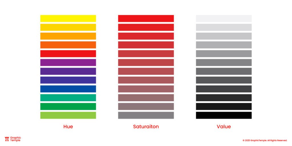
Together, hue, saturation, and value determine the full appearance of a color. Hue gives a color its identity (red, blue, green). Saturation tells us how rich or muted a color appears. Value determines how light or dark the color looks.
Changing any one of these components can completely transform the appearance of a color. For example, adding black lowers the value of a color and creates darker shades. Increasing saturation makes a color appear more vivid, and changing the hue completely shifts the color’s identity. (from blue to green, red to orange) Even when the hue stays the same, adjusting saturation and value can produce dozens of variations of that color. Together, these three components allow designers and artists to create harmonious color palettes that convey emotion, contrast, readability, and strong visual impact.
How Value in Color Theory Affects Design and Composition?

Value plays a crucial role in visual communication because it influences how a design looks, reads, and works. High-value contrast, such as placing light elements against a dark background, creates a bold, dynamic, and attention-grabbing effect. High contrast naturally pulls the viewer’s eye toward the most important areas of a design. On the other hand, low contrast creates a softer and more gentle effect. It’s calm, quiet, and often used when the goal is elegance or minimalism rather than impact.
Value can also be used as a powerful tool to control the viewer’s focus. Using lightness and darkness strategically can guide the viewer through the design and communicate the message more effectively. For example, a bright highlight against a darker background instantly becomes a focal point. This establishes a visual hierarchy and directs the viewer’s attention to the most important elements first.
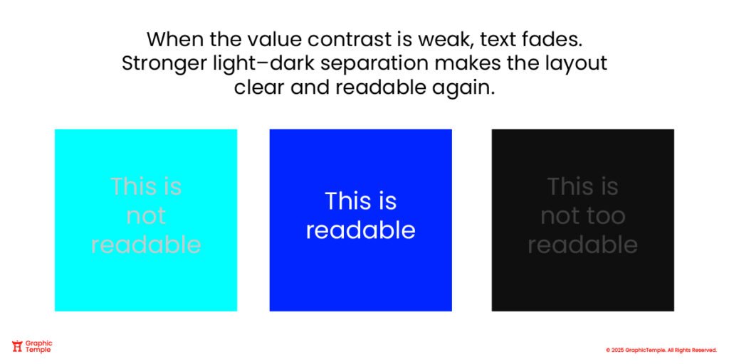
Value contrast has a major impact on readability. Suppose the text and background have similar values (light grey text on a slightly lighter grey background); the text becomes difficult or even impossible to read. Using value effectively, such as white text on a black background or light green text on a dark blue background, improves clarity, accessibility, and the overall user experience.
Value also gives a design depth and dimension. Even in a flat or minimalist design, a slight change in value can separate the foreground and background, helping build a hierarchy between elements and objects. Variations in light and dark can add structure to a simple layout. This is why value is so powerful and matters just as much as hue or saturation. It gives designs clarity and shapes how effectively their message is communicated.
Tints, Shades, and Tones: How Adding White, Black, and Gray Changes Value
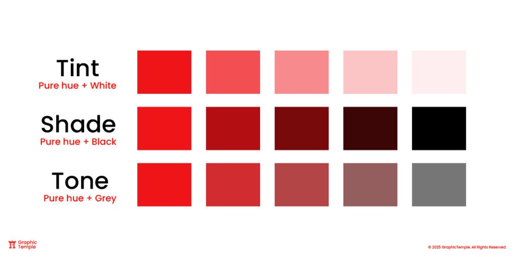
When white is added to a color, it creates a tint, increasing its value and making it appear lighter. Tints often evoke feelings of softness, calmness, delicacy, or playfulness (like pastel pinks, baby blues, or mint greens). Tins are often used in designs that aim to create a friendly, gentle, or peaceful mood.
A shade is created when black is added to a color, lowering its value and making it appear darker. Shades often feel bold, dramatic, moody, or intense (like burgundy, forest green, or navy blue). Darker colors can add seriousness, depth, and contrast, making them useful for elegant, dramatic, or powerful visual themes.
When a color is mixed with gray, it creates a tone that softens the color without making it noticeably lighter or darker. Tones are more muted and balanced. They evoke subtle, calm, and sophisticated emotions because gray reduces the intensity of the hue. Designers often use tones to create a mature and professional atmosphere without relying on harsh lighting or darkness.
Understanding how to use value to create tints, shades, and tones allows designers to evoke different emotions in designs using the same hue. For example, bright red can feel energetic and intense, but as a tint (light pink) it feels gentle and romantic, and as a shade (deep maroon) it feels luxurious or dramatic. Mastering the value in color theory enables you to convey different emotions with a single color. That’s why value is such a powerful tool.
Why Value in Color Theory Matters More Than Color?

When you take color out of a design and view it in simple grayscale, what’s left is value, the play between light and dark. That balance alone decides whether a layout feels calm and readable or messy and unclear. Even without a hint of color, a piece with strong value contrast still works because its structure and hierarchy stand firm. But when that contrast is missing, everything starts to feel dull and flat, no matter how bright the colors once were.
“Value does the heavy lifting; color gets the credit.”
Color tends to grab our attention right away, but value is what quietly holds everything together. It shapes structure, hierarchy, and depth, the invisible framework that gives a design life. When the value contrast is solid, color naturally finds its place and feels harmonious. But when that balance is weak, even the most vibrant palette falls apart. That’s why it’s worth training your eye to see value clearly; it’s one of the most reliable ways to make your colors sing.
Why Value Matters in UI, Illustrations, Branding, and Typography?
Value is a key aspect in UI design, Illustrations, Branding, and typography. In UI design, value helps create hierarchy. Lighter or darker values are often used in Buttons, icons, and other important actions. Using value effectively helps the layout stand out and guide users intuitively. In illustration, value helps build mood and atmosphere; soft, low-value contrast can feel calm and dreamy, while strong contrast adds drama and focus.
Value is also crucial in branding and typography. When the contrast between the text and background isn’t strong enough, the words start to fade, even if the colors themselves look nice. I’ve seen this happen a lot with minimalist or flat designs. Everything looks clean, but without enough value contrast, it all starts to blend together. A little separation in light and dark makes the layout feel structured, readable, and alive again.
How to Test and Adjust Value?
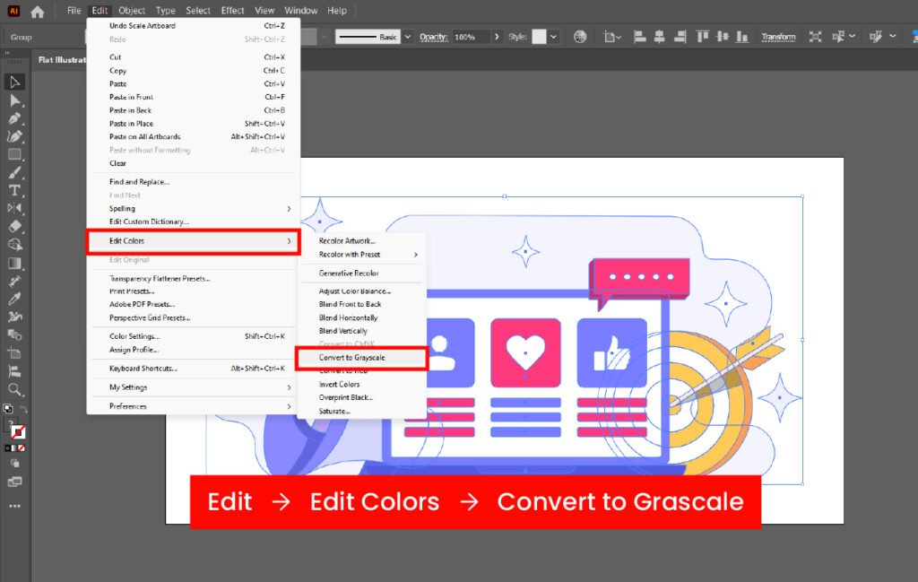
For us designers, the Easiest way to test and adjust value in a design is to convert artwork to grayscale in programs like Adobe Photoshop or Adobe Illustrator. Removing color makes it easy to see whether important elements stand out or if everything blends together. If text, buttons, and focal points remain clear, the value contrast is strong. You can also use contrast-checking tools or value maps to measure whether light and dark relationships are readable and accessible. These quick tests help confirm that a design is visually clear and user-friendly, even before color is added.
Value in Real-World Examples and Famous Arts

One of the best ways to understand value is through black-and-white photography. With no hue or saturation present, the entire image relies on light and dark to create depth, contrast, and mood. It’s a perfect example of the power of value in color theory.
The same idea appears in both historic art and modern design. Vincent van Gogh’s paintings use dramatic value shifts to create movement and intensity. In modern digital designs, light and dark UI themes also show the importance of value. Buttons, icons, and text must remain clear and readable in both dark mode and light mode. These examples demonstrate that value in color theory extends beyond theoretical knowledge; it’s a practical element underlying the visuals we interact with every day.
Value in Color Theory: The Hidden Structure Behind Good Design
Mastering value in color theory can help you make your designs actually work. When the light and dark areas of a composition are well balanced, everything feels clearer and easier to look at. Text becomes more readable, shapes stand out, and the entire design feels more intentional. Even the brightest, most beautiful colors won’t save a design if the value structure underneath is weak. However, with the correct use of value, you achieve contrast, depth, and visual focus, even in flat or minimalist artwork.
So here’s the takeaway: focus on value first, color second. A quick grayscale check can instantly reveal whether the layout is strong. If it reads well without color, it will look even better once color is added. In a way, value is the skeleton that holds the whole design together. Once that structure is solid, color harmony naturally falls into place.
If you ever feel unsure, or if something “looks off” in your design, try removing the color and look only at the values. You’ll be surprised how clear the answer becomes.
If you still have questions or want help with a design topic, feel free to leave a comment or send us a message. We’re always happy to help.
Before You Go: Key Questions About Value
01. What are the three main properties of color?
The three main properties of color are hue, saturation, and value. Hue is the color itself (yellow, blue, green), saturation shows how vivid or muted the color is, and value describes how light or dark the color appears.
02. What’s the difference between tints, shades, and tones?
A tint is created when a hue is mixed with white, making it lighter. A shade is a hue mixed with black, making it darker. A tone is created when a hue is mixed with gray.
03. How do hue, saturation, and value work together?
Hue gives a color its identity, saturation controls intensity, and value determines lightness or darkness. Changing any of these can completely transform how a color looks and how it feels in a design.
04. Why is value important in UI design?
Value contrast affects readability and usability. Strong contrast makes text clear and easy to read, while low contrast can cause text to blend into the background.
05. What is the best way designers can test and adjust value?
The easiest way to test and adjust the value in a design is to convert the artwork to grayscale in programs like Adobe Photoshop or Adobe Illustrator.